KSU Brand Color Palette and Usage

Kennesaw State's primary brand colors are Black and Gold—our most powerful and recognizable visual elements that symbolize the University's strength, pride, and tradition. We've also updated the secondary color options to provide flexibility while maintaining a unified look across all designs. Use the approved color palette to guide your layouts and ensure consistency across every medium.

Download the color charts(PDF) for print and digital to guarantee color accuracy. Here, you'll find Kennesaw State's primary and secondary brand colors, along with guidance on color usage, accessibility best practices, and licensing standards.

  • Pantone 1235 Gold is recommended for merchandise applications such as fabrics, plastics, and licensing standards.
  • Pantone 123C is ideal for coated paper printing.

The use of Kennesaw State branding on merchandise is managed by Trademark Licensing. For official color spec sheets or approval, please contact Brand Support.

Color Palette

Black and Gold should be the main colors for Kennesaw State communications because it easily connects back to our primary identity. Only use tints of the brand colors in illustrated elements.

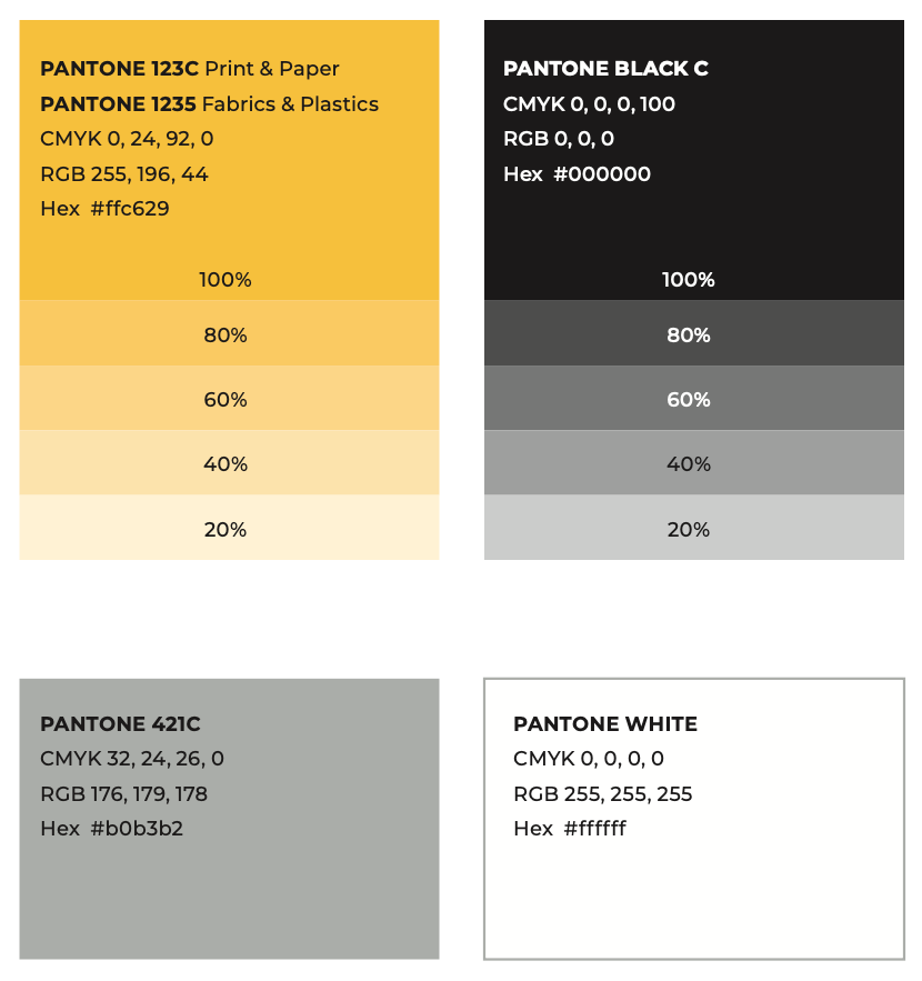
Kennesaw State University brand color palette displaying Pantone 123C yellow, Pantone Black C, Pantone 421C gray, and Pantone White. Pantone 123C and Pantone Black C each show color tints at 100%, 80%, 60%, 40%, and 20%, with CMYK, RGB, and Hex values listed for each color.

The use of our primary and complementary color palette will be a consistent part of our branding. Complementary colors are to be used as accents and added to the primary color palette.

For the Institutional level designs complementary colors should not be used as primaries; the complementary colors were developed to complement our primary colors not to overtake them. The use of colors other than our official primary colors is acceptable but they must be used complimentary or accents to our primary colors.

Other colors can be used for event marketing or promotion, but the alternate color must have a direct meaning or connection to the promotion or event (i.e. pink = breast cancer awareness). If applying the logo on any complementary or alternate color the university logo should be applied in all white.

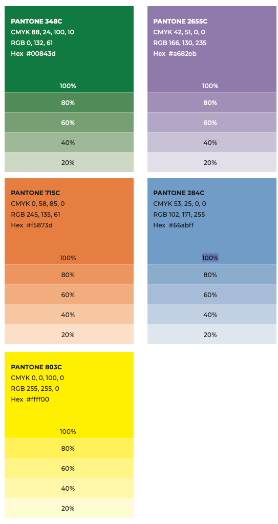
Kennesaw State University secondary color palette displaying Pantone 348C green, Pantone 2655C purple, Pantone 715C orange, Pantone 284C blue, and Pantone 803C yellow. Each color includes CMYK, RGB, and Hex values, with tints shown at 100%, 80%, 60%, 40%, and 20%.

Color Usage

The following guidelines will help provide a sense of hierarchy, balance and harmony. Our color system can be flexible when needed, but restraint is highly encouraged. Balance ratios on individual pages, spreads and other layouts will vary from time to time.

However, remember that our primary colors should be predominant overall.

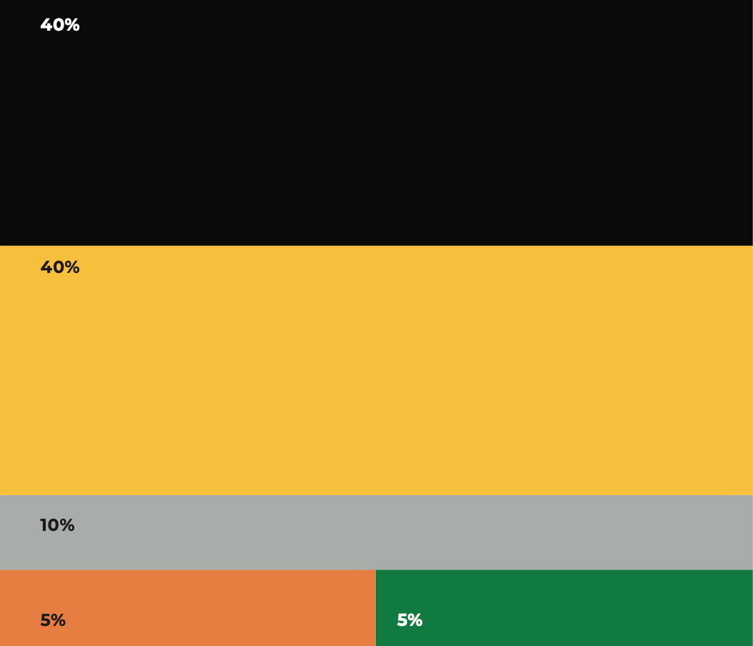
Kennesaw State University brand color proportion guide showing 40% black, 40% gold, 10% gray, 5% orange, and 5% green to illustrate recommended color usage balance in designs.

Best Practices

Best Practices for Using Color

Our primary colors should be present in all communications. Never use our complementary colors as primaries; they were developed to complement our core colors, not to overtake them try to limit the use of complementary colors to less than 10% of overall design. A maximum of two complementary colors at a time is encouraged. However, when the need to differentiate parts of complex content arises, additional complementary colors can be added thoughtfully and sparingly. Provide high contrast for accessibility purposes. Ensure that color contrast passes accessibility standards.

Best Practices for Using Text on Color

Provide high contrast. Our communications must be created to be accessible to all. Ensure that color contrast passes accessibility standards. Legibility is paramount. Check your color combinations for body copy and headlines.

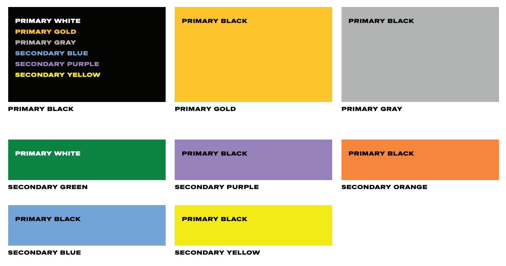
Text version of the Kennesaw State University brand colors for text contrast graphic:

Accessibility compliance chart comparing Kennesaw State University brand colors for text contrast in compliance with Web Content Accessibility Guidelines (WCAG) 2.1 AA guidelines. It shows that black text passes AA and AAA on gold, gray, orange, yellow, blue, and purple backgrounds; white text passes on black and green backgrounds; KSU gold (Pantone 123C) text only passes on a black background.

Kennesaw State University brand colors for text contrast.

Accessibility Compliance Levels (Max Ratio 21:1) apply to pure black (#000000) and pure white (#FFFFFF) colors. 
Minimum Contrast ratio requirements for WCAG 2.1 AA are (4.5:1) this applies to all body text under 18pt (or under 14 pt bold).
Minimum Contrast ratio requirements for WCAG 2.1 AAA are (7:1) this applies to all body text under 18pt (or under 14 pt bold).